- Ideation
Our ideation as a group started with talking about a name for our brand and the different icons we think represented our brands identity. Some of the aspects as a group we wanted our brand to convey included; functional, engaging, exciting,active, and rewarding.
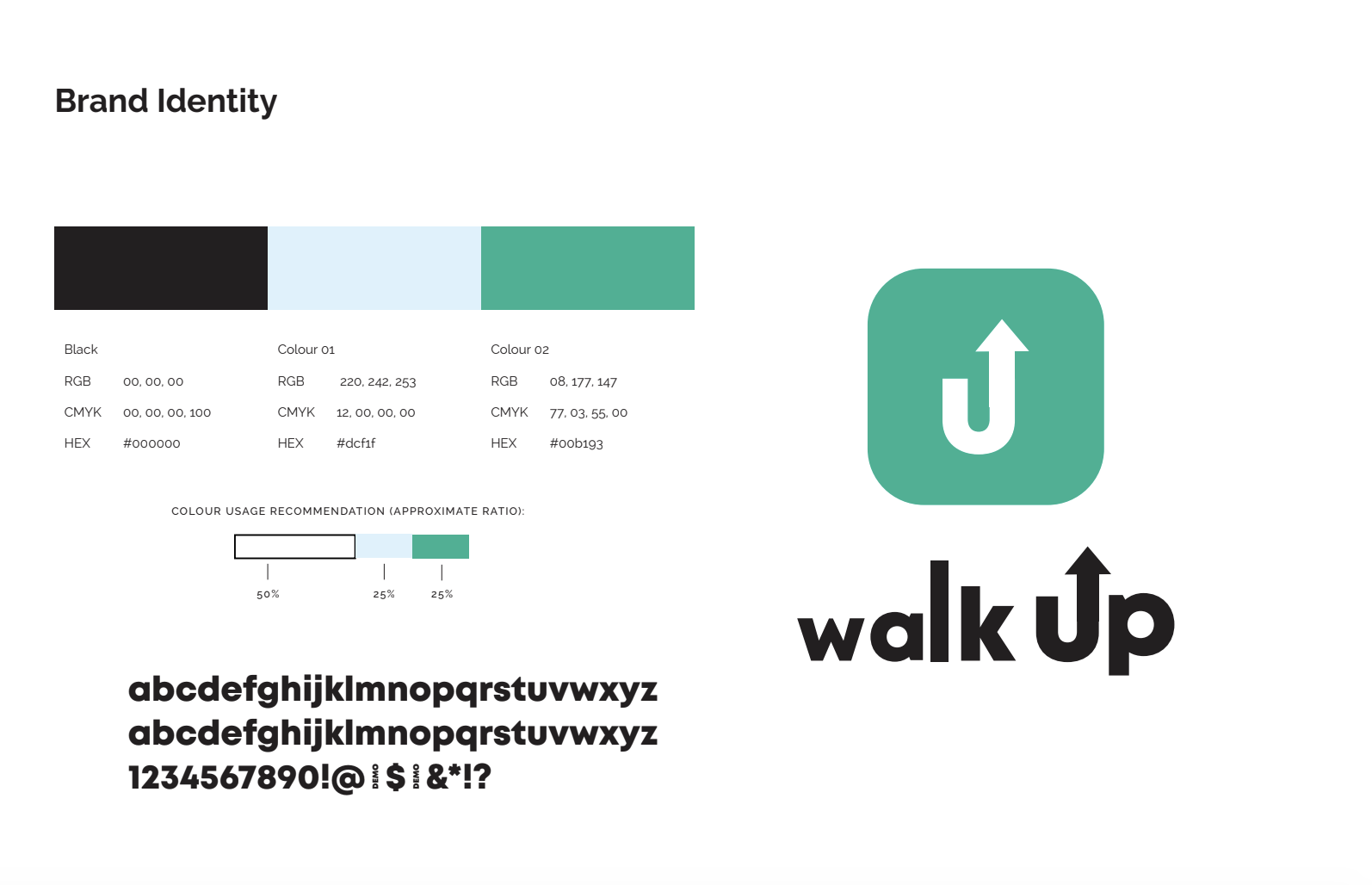
We each individually found different fonts and created logos and app icons. Within this ideation we realised that an app icon is very small and for an icon to work well the symbol inside must be quite large. As a group we decided to step back and ideate a finished logo before jumping back to creating the icon.
We experimented with a font we found during the icon ideation and played with the letters to create a kinetic movement within a static text. The movement helped to give emphasis when reading the word. We also stretch the “L” to create a bar rising look which reflects back to our brands identity of movement upwards and achieving goals. We added the arrow on top of the “U” to emphasis the movement upwards in a more straightforward way. We merge all 3 small adjustments to create our final logo. This logos size from left to right very gradually increasing in size of each letter.
- Prototypes
Once we had established our logo and icon. We were able to move on further tested how the logo worked with colours and composition. We used the App to ideate and test out a lot of colours to see how they could work with the user interfaces.
This helped a lot as we were able to see what worked and what did not without making any final choices on colours and being open to changes. After these prototypes we realised our colour palette was not working well for functionality and created a “feminine” look to the brand.
As our group was open to changes in our prototyping phase we were able to successfully step back and ask for some feedback and advice from tutors and classmates.
- Refinements
With feedback we were able to test new colours that worked well with user interfaces. The new colours also reflected our brand identity better by using two natural earth colours that could contrast well on print and digital.
