The three main important aspects of our posters:
Colour
Catchphrases
Point of difference
When it came to designing the posters these were some certain concerns and targets we were aiming to use effectively, in each step of the process each of these elements were improved.
Colour
The poster needed to use similar aesthetic codes as other posters that are seen publicly do, so we made the colours bright, our main images large so that people walking by our posters on Symonds Street would see the subject easily, and also see the brand icon easily. Posters are often conveying their brand name and providing their logo, with a catchphrase and a large image to draw viewers in.
Catchphrases
Making catch phrases that were simple and conveyed a piece of our brand, we started out with these catch phrases ‘ Your health, your wealth. Upload you info to our app and reap financial rewards.’ ‘Step by step financial walking plan’, Step by step plan to reduce your eco footprint,’ and ‘Did you know that you save 45.00 p/w when using our app for an hour each weekday?’
We slightly changed these to make simpler and shorter phrases to make people’s lives easier when reading, and doing our best to make our brand communicate its content simply and clearly.
The catch phrases changed to ‘ ‘Did you know you save 45.00 per week when using our app?’ Did you know… walking 21km using our app you can get a free coffee?’
These phrases are simple and therefore we hope communicates our purpose and who we are as an app.
Point of Difference: Augmented Reality
The posters involve augmented reality aspects, which needed to be constantly tested. One way that we chose to test to see if the AR was effective, was to print out small hand out cards to and see if phones would be able to pick up the AR through the Roar app. Through this process we discovered that some people could not access the AR, and some could. The people who can use our AR are people who have Iphones or latest models of phones purchased in 2019.
As a point of difference to the competitors we used AR, as this is a very recent technology that shows that our product is staying up to date with the current trends.
We created AR motions that were simple and would be subtle, to convey the concept of someone feeling like they were entering into a bitmap world, where everything looks similar but it’s all a bitmap gaming world simulation of the world they live in.
People hold up their phones to the poster, to be able to reveal that posters special AR function. By adding this it means that people can go and scan each poster to see how they can change, in order to engage the customers of our app. Our intent was to hook each of our customers through this feature.
The intent of the AR is to show people the message of our app that we are mixing gaming and reality together, shown through people scanning posters which turn into a different world inside the internet.
Below you will see how we put all of these elements together to get to our final poster series.
Design Iterative Process
Initial Icons
First Poster Iterations( Should be from yellow colour first then blue posters after.)
The concept for the first posters were to try and start combining the gaming aspect and also people transitioning into that gaming experience. From feedback from friends they said they liked the idea behind it but its not bold nor interesting enough to attract people to look at the posters.
Second Iterative Process
Second look at the approach design wise for the posters, we transitioned front the orange and pink colours into our new colour scheme. The original design style was helpful in starting off the ideas for what kind of content the poster should include, but the style was outside of what the group collectively decided as our design style the day this poster was created.
We then looked into the bitmap style which is closer to the concept of gaming, making clear what our app was all about. The next steps were making bitmap images. As a group we all contributed to the designs and each created some bitmap icons that could be used throughout all the designs.
Second Icons
Final Outcomes
Seeing the most effective and bold images from the whole process we put all of the best aspects of all the posters together, and merged them with our final colour scheme.
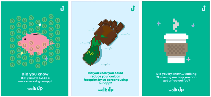
The final design style guide is: Large image in the centre of the poster, and the icon on the top right, and centre aligned text on the bottom middle of the poster. To keep it cohesive all the posters have the same accents of stars, and little drawing accents.
Overall we found that this was the most successful due to the way these posters all are really bold and hold the eye, they would be very successful in either large or small format.
Poster 1:
The coffee cup represents rewards for our customers. When they are walking with our app, each kilometre walked will represent a monetary reward that goes towards a food or drink purchase with one of our sponsors.
Poster 2:
The footprint image represents New Zealand by the positioning, and represented being environmentally friendly. When people are using our app, they can see the stats of how their amount of hours walking would be a certain amount of greenhouse gas if they had taken their car.
Poster 3:
The piggy represents the way that Kiwi’s save their money. This poster is representing the financial savings that are available through the Walk Up App. When you use the app there is a tally of how many points that you gain as you walk.
